
At least another 130,000 people worldwide have died during the coronavirus pandemic on top of 440,000 officially recorded deaths from the virus, according to BBC research.
A review of preliminary mortality data from 27 countries shows that in many places the number of overall deaths during the pandemic has been higher than normal, even when accounting for the virus.
These so-called “excess deaths”, the number of deaths above the average, suggest the human impact of the pandemic far exceeds the official figures reported by governments around the world.
Some will be unrecorded Covid-19 victims, but others may be the result of the strain on healthcare systems and a variety of other factors.
Explore the animated guide to excess deaths below and scroll further to see how the pandemic has affected countries such as Brazil, Italy, South Africa and the UK.
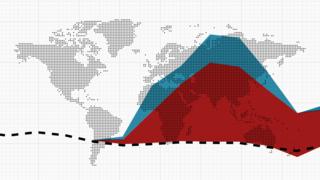
An animated guide: What are excess deaths?
-
Let’s use the UK as an example. If 2020 had been an average year, the dotted line in the chart below shows how many people we would have expected to die each week. This is known as expected deaths and is calculated based on the number of deaths in previous years.
-
Any deaths above those expected are known as excess deaths. During the coronavirus pandemic, many countries have recorded significantly more deaths than expected this year.
-
Many of these excess deaths can be explained by the number of people who were officially confirmed to have had Covid-19. But in many places, that does not account for all the excess deaths.
-
These other excess deaths may have been, directly or indirectly, caused by the coronavirus pandemic.
-
The total number of excess deaths shows a more complete picture of the human scale of the coronavirus outbreak.


Directly comparing the death toll between different countries is difficult. The accuracy of coronavirus data depends on how many people are tested for the virus and whether governments include deaths outside hospitals in their counts.
As the virus has spread around the world, countries have reached different stages of their outbreaks at different times. In some places, the number of excess deaths may still increase in the coming weeks and months, especially as figures are revised, while in others the number of deaths is beginning to return to normal levels.
Analysing deaths from all causes during the outbreak and comparing them with deaths in the same period from previous years can begin to provide a more accurate, if still provisional, assessment of the coronavirus pandemic’s true death toll.
Read through our analysis of excess deaths in 27 locations and personal stories highlighting some of the tragic consequences of the pandemic.
There is no definitive league table of the hardest hit, but we can still make broad comparisons between the countries through the first wave.
Peru, Chile and Brazil are still dealing with growing numbers of deaths so the picture there will change rapidly over the coming weeks.
The picture is more stable in countries where the total number of deaths has peaked and is now back to, or near to, normal.
Among these countries, there’s a group like the UK, Spain, Italy and Belgium who have seen deaths rise by more than 30%.
That’s very different to Japan or Germany, or many other countries whose weekly deaths have stayed within about 5% of normal.
If we looked at the data slightly differently – counting deaths per head of population, or using the same number of weeks for every country – we’d get slightly different results.
And the data itself is only provisional.
So we can’t produce a precise ranking of countries, but we can identify the unhappy club of hard hit countries whose membership, unfortunately, is only going to grow.
Read more from Robert about how countries compare
How are excess deaths measured?
To measure excess deaths, we have used mortality data showing deaths from all causes. These types of reports are often recorded and published by the central civil registry, health ministry or a country’s statistical authority. They can take significant time to process and confirm, so all numbers of deaths recorded in recent months are preliminary and subject to revisions, and likely to include more deaths.
The number of excess deaths represents the total number of deaths above the historical average. These figures have not been adjusted for age, so do not take into account demographic differences across country populations.
The total number of excess deaths for each country have been rounded to the nearest hundred.
How were countries chosen?
We have focused on locations that have robust mortality data covering at least four weeks from the start of the coronavirus pandemic in that place. Where reliable data is not available at the national level, we have focused on a smaller region with complete data, such as Istanbul in Turkey. In Jakarta, Indonesia, records of burials within the city serve as a proxy for death counts.
How was the outbreak defined in each area?
The start of each location’s outbreak is counted from the week or month during which it recorded its fifth official death from Covid-19. The period extends to the latest date for which there is available data that is unlikely to change significantly.
In most cases, we have calculated our baseline of expected deaths from an average of reported fatalities for the area over five years, from 2015 to 2019. Where possible, we defer to a number of expected deaths that has been modelled by the statistical authority in that country in order to account for population changes or known environmental factors.
What does ‘none overall’ mean?
In the charts above the term “none overall” means either that all excess deaths in this particular location have been accounted for by the official coronavirus figures, or that there have been no excess deaths there.
The figure for other excess deaths is calculated by taking the total number of excess deaths minus the sum of all Covid-19 deaths during the outbreak period in each place.
What sources were used?
Counts of official Covid-19 deaths are often sourced directly from the local government’s own public reports. Where official data is not easily available, we have instead used data compiled and published by the European Centre for Disease Prevention and Control (ECDC).
For sub-national areas like Jakarta, we have used Covid-19 deaths specific to that area. For Istanbul, the available Covid-19 data is only released at the national level. This causes an underestimation of the actual number of excess deaths that are not attributed to the coronavirus in Istanbul because the number attributed to Covid-19 represents the total for the whole of Turkey.
Are there other ways to measure the virus’ impact?
Comparing excess deaths to expected deaths during a country’s outbreak is one of several ways to measure impact. It is a useful way of assessing the raw death toll in a place, expressed either as a number of people beyond the expected level or as a percentage above average.
But the duration of the outbreak plays a role in these calculations. For places that have a quick rise in deaths followed by a quick fall, like Spain, there will be fewer expected deaths during their outbreak period compared to places with an outbreak that lasted much longer, like the UK. The lower number of expected deaths for Spain makes its excess appear much higher in percentage terms.
Another measure is to look at the excess deaths per million of population. The benefit is that it puts countries of differing populations on a more level playing field. However, measuring by deaths per million will look worse for a country with an older or less healthy population, since it doesn’t account for the fact that an ageing country would expect to see more deaths.
Sources
Statistik Austria; Belgium Mortality Monitoring; Sciensano; Belgian Institute for Health; Civil Registry of Brazil; Chile Civil Registration and Identification Service; Chile Ministry of Science, Technology, Knowledge and Innovation; Chile Ministry of Health; Statistics Denmark; Ecuador General Directorate of the Civil Registry; Ecuador National Institute of Statistics and Census (INEC); French National Institute of Statistics and Economic Study (Insee); Germany Federal Statistics Office; DKI Jakarta Provincial Park and Forest Service; Iran National Organisation for Civil Registration; Iran Ministry of Health; Italian National Institute of Statistics (Istat); Japan Bureau of Statistics; Ministry of Internal Affairs and Communications; Statistics Netherlands (CBS); Statistics Norway; Peru Ministry of Health; Peru National Information System of Deaths (SINADEF): Portugal Directorate-General for Health; Moscow Office of Civil Registration; Moscow Government; St Petersburg Office of Civil Registration; Statistical Office of the Republic of Serbia; South African Medical Research Council (SAMRC); South Africa Department of Statistics (Stats SA); Statistics Korea (KOSTAT); Institute of Health Carlos III (ISCIII), Spain; Mortality Monitoring Spain; Statistics Sweden; Federal Statistical Office Switzerland; Thailand Department of Provincial Administration; Istanbul Metropolitan Municipality; Tubitak (Scientific and Technological Research Council of Turkey); Office of National Statistics (ONS); National Records of Scotland (NRS); Northern Ireland Statistics Research Agency (NISRA); State Statistics Service of Ukraine; American Centers for Disease Control and Prevention (CDC); US National Center for Health Statistics (NCHS); European Centre for Disease Prevention and Control (ECDC)
Credits
Design by Prina Shah and Zoe Bartholomew. Development by Becky Rush and Scott Jarvis. Data analysis and writing by Becky Dale and Nassos Stylianou. World Service production by Ana Lucia Gonzalez, Louise Adamou and Paul Harris. Video production by Christian Estacio, Vincente Gaibor del Pino, Isadora Brant, Claudia La Via, Sofia Bettiza, Mark Perna, Lesthia Kertopati, Said Hatala Sotta and Anindita Pradana. Illustrations by Jilla Dastmalchi. Statistical oversight by Robert Cuffe. Project management by Sally Morales. Project production by John Walton and Jacky Martens.
Additional contributions from: Stéphane Helleringer, Associate Professor, Johns Hopkins University; Dr Bernardo Lanza Queiroz, Associate Professor of Demography, University Federal de Minas Gerais; Dr Hazhir Rahmandad, Associate Professor, MIT Sloan School of Management; Navid Ghaffarzadegan, Associate Professor, Virginia Tech University; Mesut Erzurumluoglu, Research Associate, MRC Epidemiology Unit, University of Cambridge; Dr Yu Korekawa, Director for International Research and Cooperation, National Institute of Population and Social Security Research

Cory Weinberg is a contributor to Sproutwired.com, covering a wide range of topics including news, politics, business, technology, sport, entertainment and lifestyle. He focuses on delivering clear, balanced reporting that helps readers stay informed about current events and emerging developments. Cory’s work highlights relevant stories, practical insights and important issues affecting communities and industries, with an emphasis on accuracy, clarity and information that readers can trust.


